 Open Sustainability
 “Carbon dioxide data is not on the world’s dashboard” says Hans Rosling
Jonathan Gray - January 21, 2013 in Carbon Emissions, Featured
*[Professor Hans Rosling](http://en.wikipedia.org/wiki/Hans_Rosling), co-founder and chairman of the [Gapminder Foundation](http://www.gapminder.org/) and [Advisory Board Member](https://okfn.org/about/team/board/#professor-hans-rosling) at the Open Knowledge Foundation, received a standing ovation for his keynote at [OKFestival](http://okfestival.org/) in Helsinki in September in which he [urged open data advocates to demand CO2 data from governments around the world](https://blog.okfn.org/2012/09/21/demand-carbon-dioxide-data-says-hans-rosling-to-open-data-advocates-at-okfestival/).*
*Following on from this, the Open Knowledge Foundation’s [Jonathan Gray](http://jonathangray.org/) interviewed Professor Rosling about CO2 data and his ideas about how better data-driven advocacy and reportage might help to mobilise citizens and pressure governments to act to avert catastrophic changes in the world’s climate.*
**Hello Professor Rosling!**
Hi.
**Thank you for taking the time to talk to us. Is it okay if we jump straight into it?**
Yes! I’m just going to get myself a banana and some ginger cake.
**Good idea.**
Just so you know: if I sound strange, it’s because I’ve got this ginger cake.
**A very sensible idea. So in your talk in Helsinki you said you’d like to see more CO2 data opened up. Can you say a bit more about this?**
In order to get access to public statistics, first the [microdata](http://en.wikipedia.org/wiki/Microdata_(statistics)) must be collected, then it must be compiled into useful indicators, and then these indicators must be published. The amount of coal one factory burnt during one year is microdata. The emission of carbon dioxide per year per person in one country is an indicator. Microdata and indicators are very very different numbers. CO2 emissions data is often compiled with great delays. The collection is based on already existing microdata from several sources, which civil servants compile and convert into carbon dioxide emissions.
Let’s compare this with calculating GDP per capita, which also requires an amazing amount of collection of microdata, which has to be compiled and converted and so on. That is done every quarter for each country. And it is swiftly published. It guides economic policy. It is like a speedometer. You know when you drive your car you have to check your speed all the time. The speed is shown on the dashboard.
Carbon dioxide is not on the dashboard at all. It’s like something you get with several years delay, when you are back from the trip. It seems that governments don’t want to get it swiftly. And when they publish it finally, they publish it as total emissions per country. They don’t want to show emission per person, because then the rich countries stand out as worse polluters than China and India. So it is not just an issue about *open* data. We must push for change in the whole way in which emissions data is handled and compiled.
**You also said that you’d like to see more data-driven advocacy and reportage. Can you tell us what kind of thing you are thinking of?**
Basically everyone admits that the basic vision of the green movement is correct. Everyone agrees on that. By continuing to exploit natural resources for short term benefits you will cause a lot of harm. You have to understand the long-term impact. Businesses have to be regulated. Everyone agrees.
Now, how much should we regulate? Which risks are worse, climate or nuclear? How should we judge the bad effects of having nuclear electricity? The bad effects of coal production? These are difficult political judgments. I don’t want to interfere with these political judgments, but people should know the orders of magnitude involved, the changes, what is needed to avoid certain consequences. But that data is not even compiled fast enough, and the activists do not protest, because it seems they do not need data?
Let’s take one example. In Sweden we have data from the energy authority. They say: “energy produced from nuclear”. Then they include two outputs. One is the electricity that goes out into the lines and that lights the house that I’m sitting in. The other is the warm waste water that goes back into the sea. That is also energy they say. It is actually like a fraud to pretend that that is energy production. Nobody gets any benefit from it. On the contrary, they are changing the ecology of the sea. But they get away with it as the destination is energy produced.
We need to be able to see the energy supply for human activity from each source and how it changes over time. The people who are now involved in producing solar and wind produce very nice reports on how production increase each year. Many get the impression that we have 10, 20, 30% of our energy from solar and wind. But even with fast growth from almost zero solar and wind it is nothing yet. The news reports mostly neglect to explain the difference in percentage growth of solar and wind energy and their percent of total energy supply.
People who are too much into data and into handling data may not understand how the main misconceptions come about. Most people are so surprised when I show them total energy production in the world on one graph. They can’t yet see solar because it hasn’t reached one pixel yet.
**So this isn’t of course just about having more data, but about having more data literate discussion and debate – ultimately about improving public understanding?**
It’s like that basic rule in nutrition: Food that is not eaten has no nutritional value. Data which is not understood has no value.
It is interesting that you use the term data literacy. Actually I think it is presentation skills we are talking about. Because if you don’t adapt your way of presenting to the way that people understand it, then you won’t get it through. You must prepare the food in a way that makes people want to eat it. The dream that you will train the entire population to about one semester of statistics in university: that’s wrong. Statisticians often think that they will teach the public to understand data the way they do, but instead they should turn data into Donald Duck animations and make the story interesting. Otherwise you will never ever make it. Remember, you are fighting with Britney Spears and tabloid newspapers. My biggest success in life was December 2010 on the YouTube entertainment category in the United Kingdom. I had most views that month. And I beat Lady Gaga with statistics.
**Amazing.**
Just the fact that the guy in the BBC in charge of uploading the trailer put me under ‘entertainment’ was a success. No-one thought of putting a trailer for a statistics documentary under entertainment.
That’s what we do at Gapminder. We try to present data in a way that makes people want to consume it. It’s a bit like being a chef in a restaurant. I don’t grow the crop. The statisticians are like the farmers that produce the food. Open data provide free access to potatoes, tomatoes and eggs and whatever it is. We are preparing it and making a delicious food. If you really want people to read it, you have to make data as easy to consume as fish and chips. Do not expect people to become statistically literate! Turn data into understandable animations.
My impression is that some of the best applications of open data that we find are when we get access to data in a specific area, which is highly organized. One of my favorite applications in Sweden is a train timetable app. I can check all the communter train departures from Stockholm to Uppsala, including the last change of platform and whether there is a delay. I can choose how to transfer quickly from the underground to the train to get home fastest. The government owns the rails and every train reports their arrival and departure continuously. This data is publicly available as open data. Then a designer made an app and made the data very easy for me to understand and use.
But to create an app which shows the determinants of unemployment in the different counties of Sweden? No-one can do that because that is a great analytical research task. You have to take data from very many different sources and make predictions. I saw a presentation about this yesterday at the Institute for Future Studies. The PowerPoint graphics were *ugly*, but the analysis was *beautiful*. In this case the researchers need a designer to make their findings understandable to the broad public, and together they could build an app that would predict unemployment month by month.
**The CDIAC publish CO2 data for the atmosphere and the ocean, and they publish national and global emissions data. The UNFCCC publish national greenhouse gas inventories. What are the key datasets that you’d like to get hold of that are currently hard to get, and who currently holds these?**
I have no coherent CO2 dataset for the world beyond 2008 at the present. I want to have this data until last year, at least. I would also welcome half year data but I understand this can be difficult because carbon dioxide emission vary for transport, heating or cooling of houses over the seasons of the year. So just give me the past year’s data in March. And in April/May for all countries in the world. Then we can hold government accountable for what happens year by year.
Let me tell you a bit about what happens in Sweden. The National Natural Protection Agency gets the data from the Energy Department and from other public sources. Then they give these datasets to consultants at the University of Agriculture and the Meteorological Authority. Then the consultants work on these datasets for half a year. They compile them, the administrators look through them and they publish them in mid-December, when Swedes start to get obsessed about Christmas. So that means that there was a delay of eleven and a half months.
So I started to criticize that. My cutting line was when I was with the Minister of Environment and she was going to Durban. And I said “But you are going to Durban with eleven and a half month constipation. What if all of this shit comes out on stage? That would be embarrassing wouldn’t it?”. Because I knew that she had in 2010 an increase in carbon dioxide emission and it increased by 10%. But she only published that coming back from Durban. So that became a political issue on TV. And then the government promised to make it earlier. So 2012 we got CO2 data by mid-October, and 2013 we’re going to get it in April.
**Fantastic.**
But actually ridiculing is the only way that worked. That’s how we liberated the World Bank’s data. I ridiculed the President of the World Bank at an international meeting. People were laughing. That became too much.
The governments in the rich countries don’t want the world to see emissions per capita. They want to publish emissions per country. This is very convenient for Germany, UK, not to mention Denmark and Norway. Then they can say the big emission countries are China and India. It is so stupid to look at total emissions per country. This allows small countries to emit as much as they want because they are just not big enough to matter. Norway hasn’t reduced their emissions for the last forty years. Instead they spend their aid money to help Brazil to replant rainforest. At the same time Brazil lends 200 times more money to the United States of America to help them consume more and emit more carbon dioxide into the atmosphere. Just to put these numbers up makes a very strong case. But I need to have timely carbon dioxide emission data. But not even climate activists ask for this. Perhaps it is because they are not really governing countries. The right wing politicians need data on economic growth, the left wing need data on unemployment but the greens don’t yet seem to need data in the same way.
**As well as issues getting hold of data at a national level, are there international agencies that hold data that you can’t get hold?**
It is like a reflection. If you can’t get data from the countries for eleven and a half months, why the heck should the UN or the World Bank compile it faster? Think of your household. There are things you do daily, that you need swiftly. Breakfast for your kids. Then, you know, repainting the house. I didn’t do it last year, so why should I do it this year? It just becomes slow the whole system. If politicians are not in a hurry to get data for their own country, they are not in a hurry to compare their data to other countries. They just do not want this data to be seen during their election period.
**So really what you’re saying that you’d recommend is stronger political pressure through ridicule on different national agencies?**
Yes. Or sit outside and protest. Do a Greenpeace action on them.
**Can you think of datasets about carbon dioxide emissions which aren’t currently being collected, but which you think should be collected?**
Yes. In a very cunning way China, South Africa and Russia like to be placed in the developing world and they don’t publish CO2 data very rapidly because they know it will be turned against them in international negotiations. They are not in a hurry. The Kyoto Protocol at least made it compulsory for the richest countries to report their data because they had committed to decrease. But every country should do this. All should be able to know how much coal each country consumed, how much oil they consumed, etc and from that data have a calculation made on how much CO2 each country emitted last year.
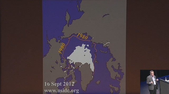
It is strange that the best country to do this – and it is painful for a Swede to accept this – is the United States. CDIAC. Federal Agencies in US are very good on data and they take on the whole world. CDIAC make estimates for the rest of the world. Another US agency I really like is the National Snow and Ice Data Centre in Denver, Colorado. Thay give us 24 hours updates on the polar sea ice area. That’s really useful. They are also highly professional. In the US the data producers are far away from political manipulation. When you see the use of fossil fuels in the world there is only one distinct dip. That dip could be attributed to the best environmental politician ever. The dip in CO2 emissions took place in 2008. George W. Bush, Greenspan and the Lehman Brothers decreased CO2 emissions by inducing a financial crisis. It was the most significant reduction on the use of fossil fuels in modern history.
I say this to put things into proportion. So far it is only financial downturns that have had an effect on the emission of greenhouse gases. The whole of environmental policy hasn’t yet had any such dramatic effect. I checked this with Al Gore personally. I asked him “Can I make this joke? That Bush was better for the climate than you were?”. “Do that!”, he said, “You’re correct.” Once we show this data people can see that the economic downturn so far was the most forceful effect on CO2 emission.
**If you could have all of the CO2 and climate data in the world, what would you do with it?**
We’re going to make teaching materials for high schools and colleges. We will cover the main aspects of global change so that we produce a coherent data-driven worldview, which starts with population, and then covers money, energy, living standards, food, education, health, security, and a few other major aspects of human life. And for each dimension we will pick a few indicators. Instead of doing Gapminder World with the bubbles that can display hundreds of indicators we plan a few small apps where you get a selected few indicators but can drill down. Start with world, world regions, countries, subnational level, sometimes you split male and female, sometimes counties, sometimes you split income groups. And we’re trying to make this in a coherent graphic and color scheme, so that we really can convey an upgraded world view.
Very very simple and beautiful but with very few jokes. Just straightforward understanding. And for climate impact we will relate to the economy. To relate to the number of people at different economic levels, how much energy they use and then drill down into the type of energy they use and how that energy source mix affects the carbon dioxide emissions. And make trends forward. We will rely on the official and most credible trend forecast for population, one, two or more for energy and economic trends etc. But we will not go into what needs to be done. Or how should it be achieved. We will stay away from politics. We will stay away from all data which is under debate. Just use data with good consensus, so that we create a basic worldview. Users can then benefit from an upgraded world view when thinking and debating about the future. That’s our idea. If we provide the very basic worldview, others will create more precise data in each area, and break it down into details.
**A group of people inspired by your talk in Helsinki are [currently starting a working group](http://sustainability.okfn.org/) dedicated to opening up and reusing CO2 data. What advice would you give them and what would you suggest that they focus on?**
Put me in contact with them! We can just go for one indicator: carbon dioxide emission per person per year. Swift reporting. Just that.
**Thank you very much Professor Rosling.**
Thank you.
*If you want help to liberate, analyse or communicate carbon emissions data in your country, you can [join the OKFN’s Open Sustainability Working Group](http://sustainability.okfn.org/get-involved/).*
